
JavaScriptを用いず、CSSのみでクリックすると開く、アコーディオンアニメーションdivボックスを実現します。ページを読み込んだ際に開いた状態とならないよう、ラジオボタンとチェックボックスの2つをフラグとして利用します。ラジオボックスの一度クリックすると外すことができない特性を利用して分岐処理を実現ます。
クリックで開くアニメーション
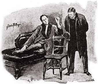 I HAD called upon my friend Sherlock Holmes upon the second morning after Christmas, with the intention of wishing him the compliments of the season. He was lounging upon the sofa in a purple dressing-gown, a pipe-rack within his reach upon the right, and a pile of crumpled morning papers, evidently newly studied, near at hand. Beside the couch was a wooden chair, and on the angle of the back hung a very seedy and disreputable hard-felt hat, much the worse for wear, and cracked in several places. A lens and a forceps lying upon the seat of the chair suggested that the hat had been suspended in this manner for the purpose of examination. “You are engaged,” said I; “perhaps I interrupt you.” “Not at all. I am glad to have a friend with whom I can discuss my results. The matter is a perfectly trivial one” –he jerked his thumb in the direction of the old hat– “but there are points in connection with it which are not entirely devoid of interest and even of instruction.”
※AMPサイト用amp-imgタグではdivボックス内に画像が正常に表示されないことがあります。現在対策を検討中です
HTML
<div id="read-more-animation" style="width: 100%; margin: auto;">
  <input id="toggle1" class="input-go1" type="checkbox" />
  <input id="toggle2" class="input-go2" type="radio">
  <div class="more-open" style="margin: 0px;">
    <label for="toggle1" class="label1">THE BLUE CARBUNCLEE - Sherlock Holmes</label>
    <label for="toggle2" class="label2">THE BLUE CARBUNCLEE - Sherlock Holmes</label>
  </div>
  <div class="first-div">
    <div class="more-contents" style="margin: 0px;"><img style="width: 300px; float: left; margin-right: 5px;" src="blue01.jpg" />I HAD ~ instruction.”</div>
  </div>
</div> /* WordPress の場合は 改行をせず詰めてください*/
スタイルシート
- label2をクリックすることで、first-divがdisplay:noneからblockへ。併せてlabel2がdisplay:noneとなり、label1がdisplay:blockとなる。そのうえで、more-contensが開くアニメーション。以後label2は封印される。
- label1をクリック(チェックが入る)するとmore-contensが閉じるアニメーション。
- label1をクリック(チェックを外す)するとmore-contensが開くアニメーション。 以後2.3.のループ。
- first-divがなければ、ページを読み込んだ際にmore-contensが閉じるアニメーションが実行されてしまう。
- toggle2がなければ、first-divをnoneからblockに変化させる動作を実行することができない。
- ラジオボックスによってページを読み込んだ1回目のみ実行するCSSを実現できる。
@keyframes open-keyanime{
  0% {
    max-height:0px;
 }
  100% {
    max-height: 600px;
  }
}
@keyframes close-keyanime{
  0% {
    max-height: 600px;
 }
  90% {
    background-color: transparent; /* chromeにおいて白い線が表示される場合があるためその対策 */
  }
  100% {
    background-color:#444444;
    max-height: 0px;
  }
}
#read-more-animation .label1,.label2{
  cursor: pointer;
 }
#read-more-animation .label1{
  display: none;
 }
#read-more-animation input{
  display: none;
}
#read-more-animation .more-open{
  font-size:24px;
  text-align: center;
  color: #ffffff;
  background-color:#444444;
}
#read-more-animation .more-contents{
  overflow-y: hidden; /* heightが低い場合、デフォルトのvisibleでは文字がはみ出してしまう */
  max-height:0px;
  border:2px solid #444444;
  padding: 0px 10px;
}
#read-more-animation .first-div{
  display: none;
}
#read-more-animation .input-go2:checked ~ .first-div { /*  */
  display: block;
}
#read-more-animation .input-go2:checked ~ .more-open .label1{ /*  */
  display: block;
}
#read-more-animation .input-go2:checked ~ .more-open .label2{ /*  */
  display: none;
}
#read-more-animation .input-go1 ~ .first-div .more-contents { /*  */
  animation-name: open-keyanime ;
  animation-duration: 2s; /* 2秒間動く */
  animation-fill-mode: both;
}
#read-more-animation .input-go1:checked ~ .first-div .more-contents{ /*  */
  animation-name: close-keyanime ;
  animation-duration: 2s; /* 2秒間動く */
  animation-fill-mode: both;
}
関連するCSSデザイン

クリックでボックスの表示非表示アコーディオンをCSSのみで実装 コピペで使えるHTML+CSS
詳細や情報をクリックすることで表示する、いわゆる、スポイラー又はアコーディオンと呼ばれるものをCSSのみで実装します。inputとlabelを使い、displayで切り替えを行います。Javascriptは使用しません。
programming-cafe.com
@keyframes規則 アニメーション コピペで使えるHTML+CSS
@keyframes規則 アニメーションの実現CSS @keyframes 目的 htmlについてアニメーションを実現します 使用 すべて アニメーションします <div class="animation-div">アニメーションします</div> @keyframes keyanime{ 0% { height:0p...
programming-cafe.com